Unless you’re brand new (in which case, welcome!), or you only ever read my posts on the WordPress reader, you’ve probably noticed the new site header! If you haven’t noticed, just scroll up a bit, it’s kind of hard to miss.
The old one looked like this:

It served its purpose while I started up, and it was nice enough to last some time after this blog got off the ground. It had a good run, with pretty colours that were still muted and calming, and a blog title in a font that referred back to the golden age of typewriters which was a not-too-subtle nod at writing itself.
But as normally happens, I got bored. And it’s not winter anymore, so it’s the perfect time to freshen up! Sooooo…

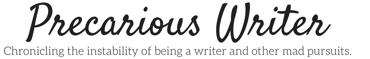
Ta daaaa!
I’ve still got the title in a precarious font, and a nod to typewriters and film scripts by having the tagline in Courier. The colour scheme isn’t a miss-mash of colours so although it’s still vibrant and bright, it’s not overwhelming. It reminds me of a beach, which seems fitting as we Segway into summer.
So what do you think? Wish I kept the old design? Think I could’ve done better? Tell me in the comments!

Looks as good as the first one but the colours are now more suited to that upcoming spring-feeling 😀
LikeLiked by 1 person
That’s what I thought, too!
LikeLiked by 1 person
So, everything was done perfectly well 😀 (I still think your blog name is terrific)
LikeLiked by 1 person
Thank you very much. Yours is awesome, too!
LikeLike
Uuuups and you got me – My face turned into a red tomato. Thanks :$
LikeLiked by 1 person