Unsatisfied with my design education (though keep in mind I’ve only been in school for 10 weeks out of 52), I spent my weekend watching videos, reading books, and researching graphic design, in particular, typography and book covers.
In class we’re working on html and we all created our own websites (yes, another) and one of my webpages is titled “Inspiration” where I put some of my favourite book covers up. I thought it was a pretty good idea, so I’m going to do it here.
Here are some of my recent favourite book covers (hover over each one to read more):
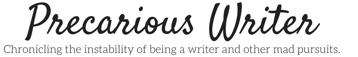
I’m loving the maximalism trend. This cover is strewn with a mess of things that will only start to make sense when you read the book. The typography is cool, too. Different, slightly odd, eye-catching, three characteristics to describe the typography and the three titular characters. Cover by Kristin Smith. (Art by Lisa Perrin.)
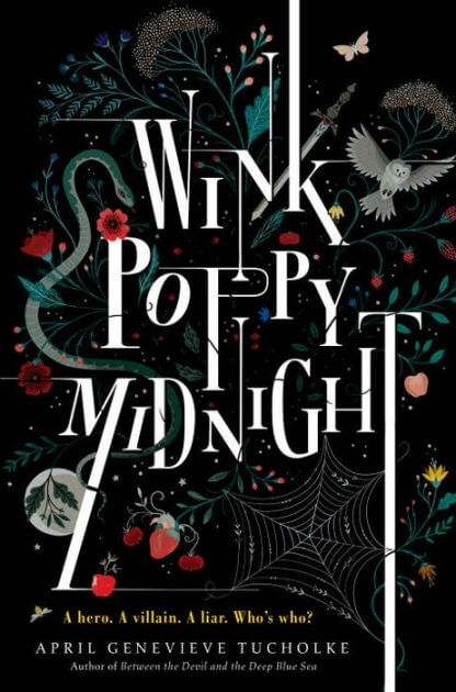
The absence of something can be very obvious, and that idea is used here to maximum effect. Succinct and understandable. Cover design by Ian Dingman.
It’s hard to understand this image on a screen, but the hardcover copy of Haruki Murakami’s novel 1Q84 has an image made in two layers, mirroring the plot about two universes. Cover Design by Chip Kidd.
I haven’t read this book, but puppies and ice cream!? Yes! This cover seems to have everything on it, but somehow nothing is lost in all the excitement. Book cover by Lucy Ruth Cummings.
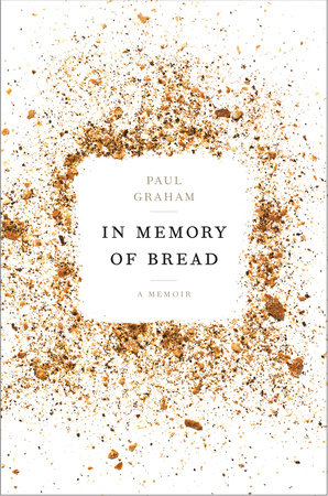
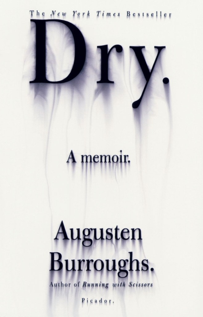
The colours are beautiful and the image reminds me of being so tired I can’t see straight, which is the point. Cover design by Kelly Hill.
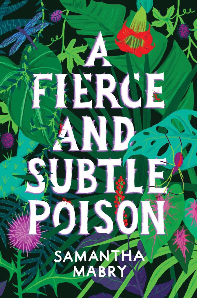
I’m pretty sure every plant on this piece of art is poisonous, maybe even deadly. Bold colours to catch your eye and still easy to read. Cover by Allison Colpoys.
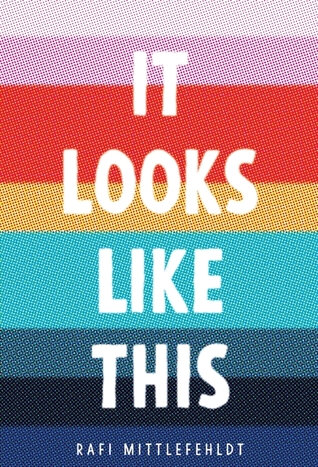
The colours are from a scene out of the book which is quoted elsewhere on the cover, but they also mimic the rainbow of the flag representing gay people, tying it in with the book even further. Cover by Matt Roeser.
Simple. Clever. Comedic. Fits the book (which I have only heard about) perfectly. Cover design by Punch Design.
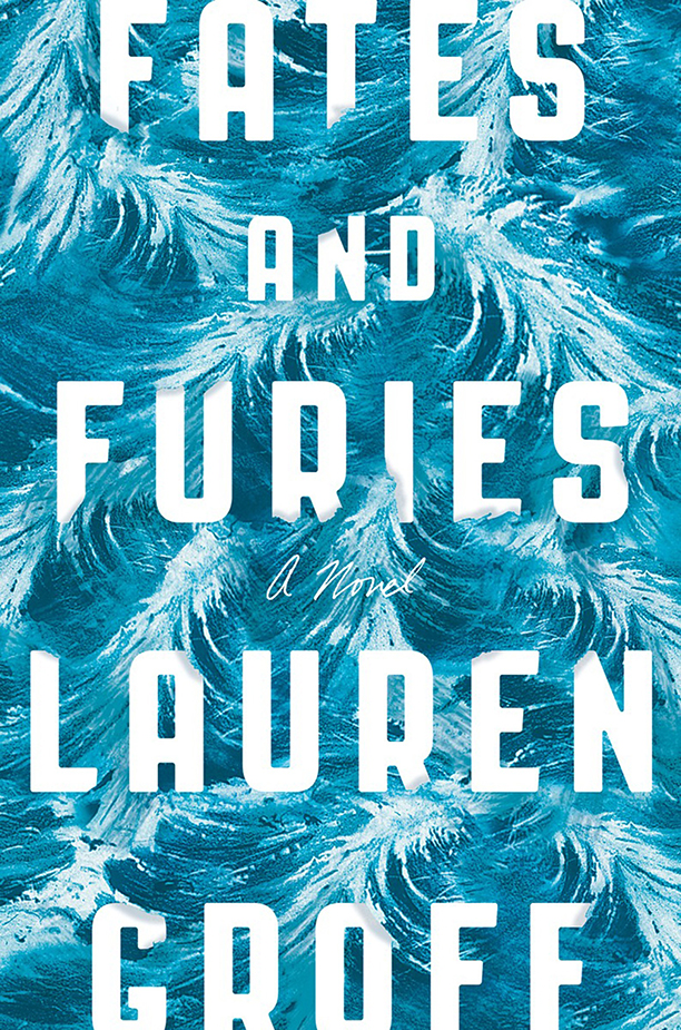
Simple, yet detailed. Monochromatic, yet interesting. Interactive text and image which convey a storm and chaos, yet clear. Good design by Rodrigo Corral and Adalis Martinez.
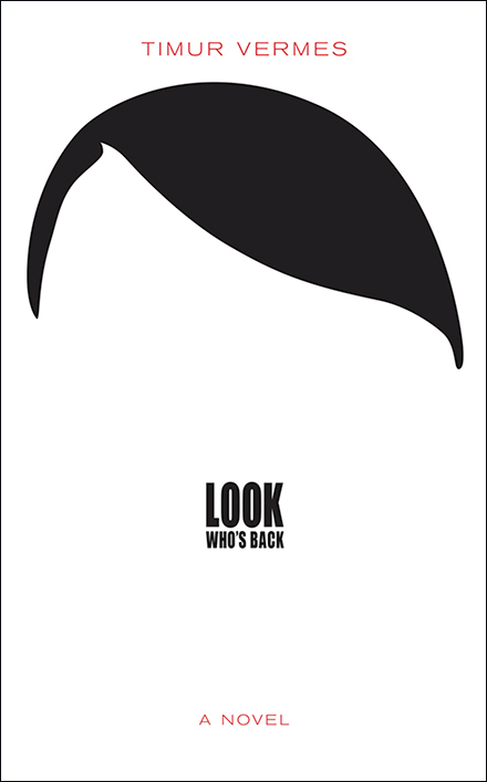
The juxtaposition makes you look twice, alluding to the lie in the book. Cover by Chip Kidd.
Covers are important pieces of art meant to entice readers and hint at the story within the book. When effective, they will be the reason why someone picks up a book in a bookstore and takes a closer look. Maybe the potential reader will even decide to buy the book based on the cover, like I did for A Fierce and Subtle Poison by Samantha Mabry this weekend.


One thought on “Inspiration: Book Covers”